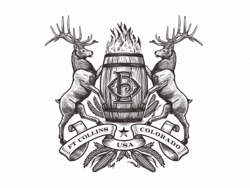
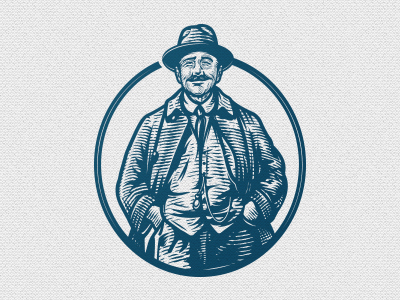
Old Elk Distillery
It's been few years, so came to say hi! Here I am sharing an older work from almost a decade ago and it was done for a Distillery in Ft. Collins, Colorado, USA.
This was a comp art, before the final revisions.
Hope to see some familiar faces in comments section :)
Cheers and Happy New year to all of you.
+431
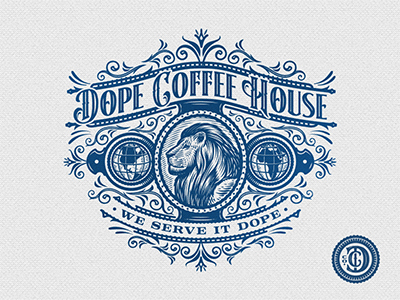
Dope Coffee House
DCH Co is differentiated by the Coffee Selection, Preparation, & Recipe options – only purchasing the finest coffees with exotic, unconventional recipes to showcase the rare flavors of the coffee and the company vibe is a combination of urban artistic expressions of cool, inspirational representations
of African American history, and excellence displayed thru knowledge, pride, and confidence.
+382
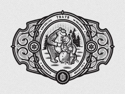
TB and TB Emblem
Emblem for the Boy and the Bear coffee company that I drew last year. Primarily will be used for merchandise.
+196
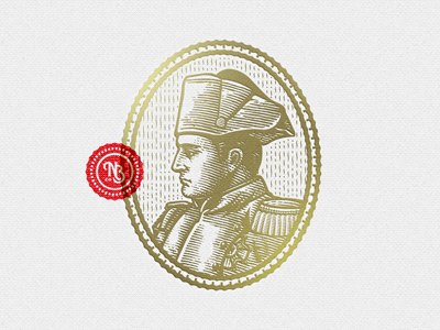
John Nagle Co
Emblem and Illustration for John Nagle Co.
John Nagle Co. is a full-line wholesaler of fresh and frozen seafood, located in Boston and was founded in 1887 by John J. Nagle. Since then, four generations of the Nagle family have upheld their strong commitment to family traditions and values within the seafood industry.
Project done in cooperation with Refinery 43 studio. Art Direction Kelsy Stromski.
+347
Bonaparte Emblem
I was commissioned to create an Emblem for a Bonaparte Brewing Co. The portrait is created as a concept for a new Slovenian Micro brewery - it have the classic and traditional feel to it and features Napoleon itself.
+439
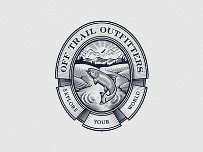
Off Trail Outfitters
Emblem for Off Trail Outfitters. They offer a wide range of outdoor products for adventurers, hunters, hikers and survivalist. Target audience is 20-50 y.o.
+212
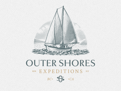
Outer Shores Expeditions
Company Summary: Small ship expedition company that runs a 70’ classic wooden schooner and offers intimate opportunities for being immersed in the ancient cultures and stunning wildlife along Canada’s Pacific Coast.
At the heart of Outer Shores is their mission of contributing to the conservation and well-being of the ecosystems, cultures and communities of coastal British Columbia.
+377
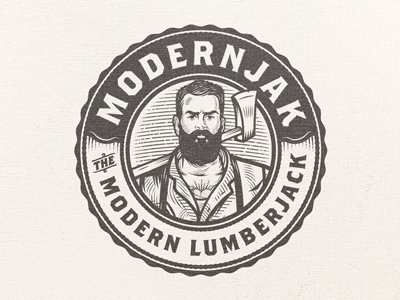
ModernJak
ModernJak is a company that produce beard oils and cremes. Brand name is inspired with Lumber Jack, but featuring a hipster.
February 2016.
+232
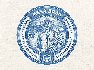
Grisalon Agroindustria Mesa Baja
Emblem for Grisalon Agroindustria and their Sub-brand called Mesa Baja(sugar cane):
Development of agro-industrial and marketing agro-organic products. GA is leading agribusiness company in the department of Quindio.
The main goal was to create a emblem that reflects the richness of the land of their region and to reflect the importance of the farmer as well. Their hard work is the platform to renew forces, create convictions and grow the passion and commitment to their identity and tradition.
+382
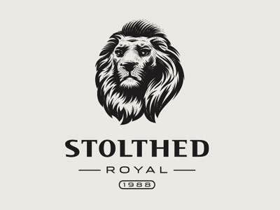
Stolthed
Stolthed on Dutch means "pride", so they wanted an portrait of a lion. They sell luxury goods.
+164
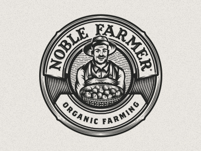
Noble Farmer
Character logo for an agriculture business, primary apples (black twigs)
+249
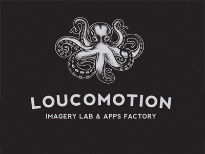
Loucomotion
Here's an a bit oldie work. Loucomotion is design studio, located in Brazil. They develop apps, web sites, doing realistic animations & illustrations.
Client wanted octopus, having handcrafted/vintage feel to it. Loucomotion in portugesse means crazy "crazymotion".
+214
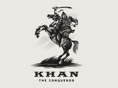
Khan The Conqueror
This work was just a practice. I am thinking to make a small project, series of 10 historical warlord leaders - Julius, Eric the Red, Alexander the Great, Bonaparte, etc.
+642
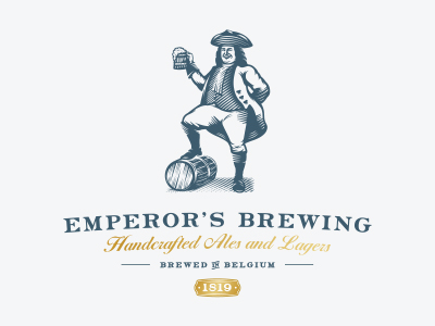
Emperors Brewing
Emperor's Brewing.
+431
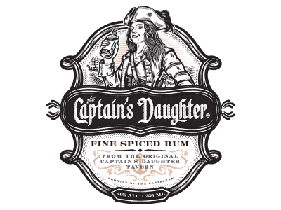
The Captains Daugther
Logo/Label for The upcoming rum called The Captain's Daughter. Logo comes as main and alternate version. Main logo will be used as and diecut label.
+299
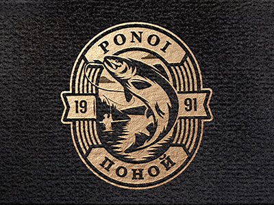
Ponoi River Company
Branding for Ponoi (“ПОНОЙ”) River Co (since 1991). - They operate high-end catch-and-release fly-fishing camps on the Kola Peninsula
(northern Russia).
he fishing is second to none and the river is known as the most prolific Atlantic Salmon river left in the world.
Target audience is 55-60 years old.
+272
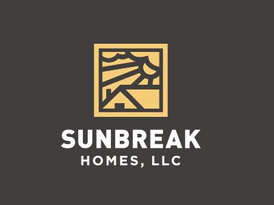
Sunbreak Homes
Real estate company. They buy homes that need work, fix them up to make them beautiful, then list them for sale. The name of Sunbreak Homes was chosen for a special reason. They are based in Seattle, WA, where it rains all the time. So, when the sun does decide to come out from behind the clouds, everybody gets excited. It's called a "sunbreak". - The imagery I had in mind for the logo is to somehow incorporate the sun's rays breaking through the clouds, keeping it simple and memorable.
+289
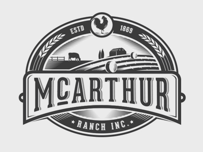
McArthur Ranch
Logo for McArthur Ranch.
2012.
+167
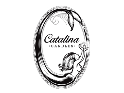
Catalina Candles
Logo for Catalina candles.
2013.
+169
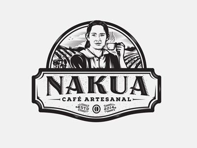
Nakua Coffee
Nakua (Bogota, Colombia) means "ground" and "region" in a dialect spoken by Guahibo natives. Nakua delivers coffee to customers, to their homes and business.
Intersting stuff is that the client wanted to honour portrait of his grandmother on the brand.
+197
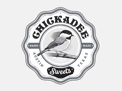
Chickadee Sweets
Chickadee sweets makes thoughtfully handmade pastries, cakes and confections.
+210
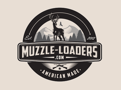
Muzzle LoadersOriginal text
They sell hunting equipment and rifles.
Designed in 2012.
+211
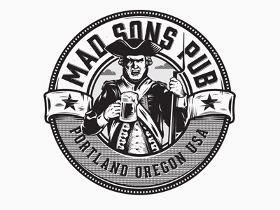
Mad Sons Pub
Logo for a revolutionary theme pub/bar located in Portland, Oregon.
+312
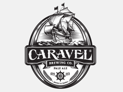
Caravel Brewing Company
Logo/label for Caravel Brewing Co, located in Canada.
+486
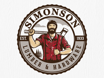
Simonson Lumber
Simonson Lumber Company is a fourth generation family owned and operated building materials supplier.
The emblem have the classic and traditional feel to it and features Lumber Jack. My job was to transmit the brand's most important values: friendliness, comfort, trustworthy and honesty.
+346