
Beyond the Rattle: Crafting Luxury for Little Ones with Smoosh's Savvy Branding
 22
22 1
1
The Shifting Sands of Baby Brand Aesthetics
For too long, the baby product aisle has been a sea of primary colors and cartoonish graphics. While charming, this aesthetic often misses the mark for modern parents who value quality, safety, and a touch of elegance in all aspects of their lives. The emergence of brands like Smoosh signals a welcome evolution, acknowledging that premium care for infants can, and should, look as refined as any adult beauty product.
This isn't just about making things 'pretty'; it's about building trust through visual cues. When parents are bombarded with choices, a brand's visual identity becomes a critical shorthand for its values—and for a baby skincare line, those values must scream reliability and gentle efficacy.
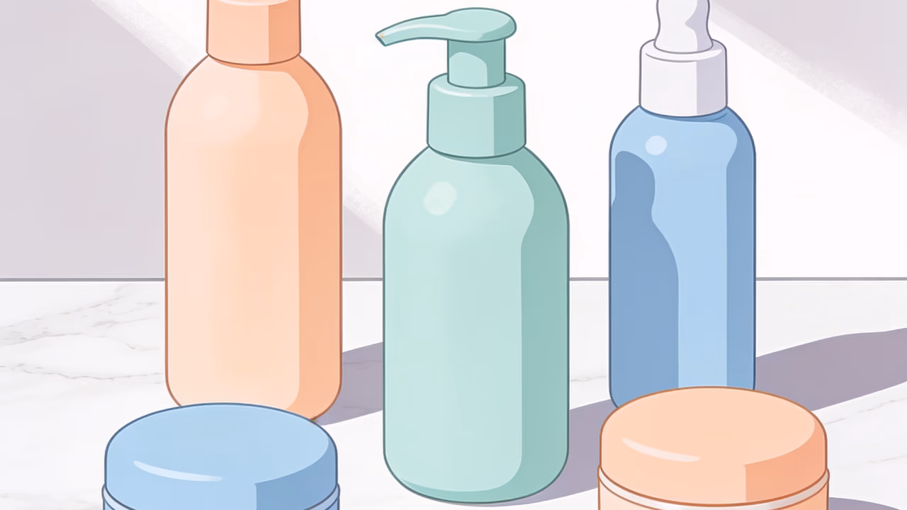
LULACREATES: Blending Softness with Shelf-Readiness
LULACREATES has masterfully navigated the delicate balance between approachability and professionalism for Smoosh. Their design choices, from the gentle typography to the soothing pastel palette, aren't just aesthetically pleasing; they are strategic decisions aimed at immediate recognition and emotional resonance on a crowded shelf. The logo itself, soft and inviting, whispers 'care' rather than shouting 'baby product.'
This thoughtful approach ensures that Smoosh doesn't get lost among its more overtly 'kiddie' competitors. Instead, it positions itself as a sophisticated option that understands the discerning parent's desire for products that are both effective and visually harmonious with their lifestyle.
The Power of Cohesive Brand Storytelling
What truly sets the Smoosh identity apart is its holistic nature. It's not just a logo or a color scheme; it's a complete visual language that extends from packaging to digital presence and marketing materials. This consistency is paramount for building a strong brand narrative, especially in a market where trust is the ultimate currency.
Every touchpoint reinforces the brand's core message of gentle, premium care. This meticulous attention to detail helps create a seamless and reassuring experience for parents, fostering loyalty even before the product is opened.
Why This Matters for Designers and Brands
The Smoosh project offers invaluable lessons for designers working in any niche market. It underscores the importance of understanding not just the end-user (the baby), but also the purchasing decision-maker (the parent) and their evolving aesthetic sensibilities. Premium doesn't have to mean exclusive; it can mean thoughtful, well-executed design that elevates the everyday.
For brands, it's a reminder that investing in a robust, emotionally intelligent visual identity is not an expense, but a crucial investment in market differentiation and long-term success. Smoosh is poised to make a splash not just because of its product, but because its brand identity speaks directly to the modern parent's aspirations.
Source: Original article
Comments:
Open For all