
Google's Gradient Gambit: The AI-Powered Shift Away From Flat Design
 49
49 4
4
The Flat Era's Sunset: A Bold New Direction for Google
For years, Google's Workspace suite has been synonymous with minimalist, flat design and its distinctive four-color palette. This aesthetic became a hallmark, influencing countless brands and digital interfaces. However, recent leaks suggest that this iconic simplicity is about to be retired, making way for a dramatic visual transformation.
The proposed 2026 redesign for core applications like Gmail, Drive, and Calendar introduces a vibrant, gradient-heavy approach. This isn't just a stylistic tweak; it's a fundamental shift in Google's visual language, signaling a departure from the clean lines we've grown accustomed to.
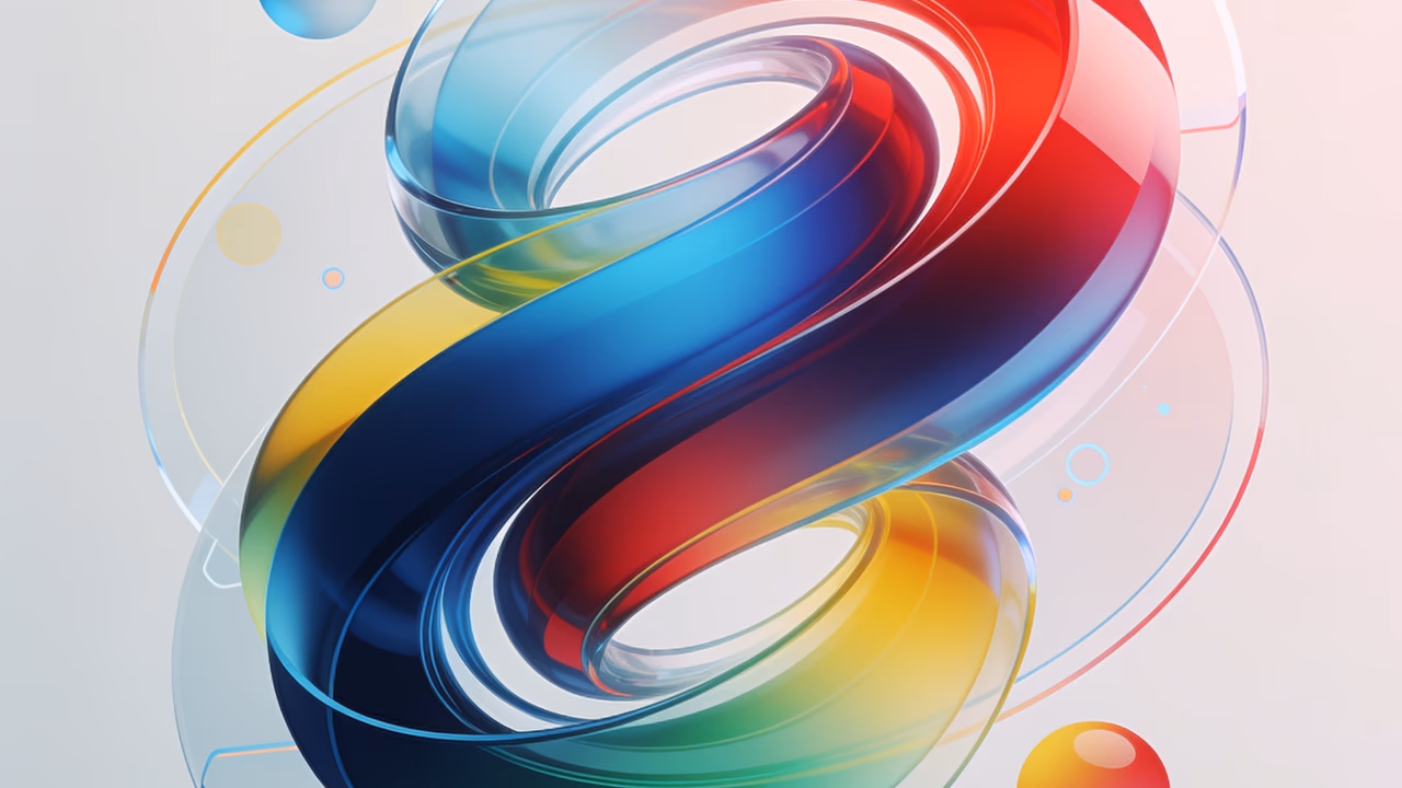
Gradients, Glass, and Gemini: An AI-Aligned Aesthetic
At the heart of this redesign is Google’s commitment to an "AI-first" aesthetic, deeply intertwined with its Gemini models. The new icons are rumored to embrace rich gradients, introducing a sense of depth and luminosity. We're talking about more than just color blends; expect to see elements of skeuomorphic flips, translucent glassmorphism, and even subtle 3D effects.
This visual vocabulary aims to convey sophistication and advanced technology, moving beyond the two-dimensional world to reflect the complex, multi-layered capabilities of AI. It’s a deliberate choice to make the interface feel more dynamic and intelligent, mirroring the underlying power of their AI systems.
Public Pulse: Mixed Reactions to the Modern Polish
As with any significant redesign from a tech titan, public opinion is already split. Some observers are applauding the fresh, modern polish, seeing it as a necessary evolution that keeps Google at the forefront of design trends. The vibrant colors and tactile feel could certainly invigorate the user experience.
Conversely, a vocal segment of the design community and general users are lamenting the potential loss of the current icons' straightforward charm. The current flat design is instantly recognizable and embodies a certain digital purity. Moving away from this could disrupt brand familiarity and aesthetic preference for many.
What This Means for Designers: A Blueprint for the Future
For designers, this leak is more than just news; it's a crucial insight into the future of digital branding. Google’s move is often a bellwether for industry trends. This signals that integrating AI capabilities will increasingly dictate visual identity, pushing brands towards more complex, gradient-rich, and dimensionally aware aesthetics.
Understanding this shift is vital. It suggests that future branding strategies might need to consider how visual elements can communicate sophistication, intelligence, and a sense of advanced interaction, moving beyond purely functional or minimalist approaches. Prepare for a world where your designs might need to subtly hint at the AI working behind the scenes.
Source: Original article
Comments:
Open For all